Cheapest Way to Make a Modern Wainscoting Accent Wall
Traditional wainscoting may not be the right style next to a modern kitchen with shaker style cabinets. Yet, I love the idea of wainscoting as it transforms a boring wall into an eye-catcher without the need of additional decor. It gives immediate character which simply helps out to stand out compared to other builder grade houses. As it stays with the house when selling, let’s make sure we get this project done on a budget to maximize the return on investment. If you have seen my previous post Cheap Board and Batten Accent Wall (No Wood or MDF needed!), then you already know my favorite hack. Yes, we will use drywall again to design the majority of the wainscoting.
Layout and Measurements
First I determined my desired layout and width of the boards. I wanted four equal spaced rectangles to elongate the room and to mimic oversized picture frames. I simply used the wainscoting calculator to give me the exact measurements by simply providing the board (stile) width (here 5.5″) and wall width (here 179″).
Preparation of the Wall and Wainscoting Elements
To prepare the wall for wainscoting I first removed the baseboard and crown molding and marked their width on the wall. This is to know exactly where to place the horizontal boards to ensure their width is not compromised by the molding later on.
Then, I cut the drywall into 5.5″ wide strips using a table saw. This is very dusty and messy which is really the only downside of this project. I made sure I had a very good dust mask (3M Respirator with P100 filters), goggles and hearing protection. I recommend doing this work outside or using a dust collection system in a well ventilated area.
I wanted to have a more sophisticated look than just a board and batten style. As you can see in the picture, I added a narrower and thinner strip to the inside of each rectangle. For those, I cut 1.5″ wide strips of 1/8″ thick MDF panel with the table saw.
Installation of the Accent Wall
First I installed the horizontal boards at top and bottom just slightly higher/lower than the mark on the wall from the crown molding and baseboard to ensure there is no gap later on. I used heavy duty liquid nails and my brad nailer. I also used the laser level throughout the installation to verify boards are level. It’s best to remeasure again the exact length before cutting the vertical boards using the miter saw.
Once the main boards are attached to the wall, I added the smaller MDF strips with heavy duty liquid nails and Bradnailer.
Finishing Touches
To smooth out any transitions and the cutting sides of the drywall, I used Easy Sand 45 Minute Lightweight Joint compound. Once dried it can be sanded to a very smooth surface and the transition between boards becomes invisible. I used a drywall sanding sponge to smooth out all edges. The sanding takes a little bit of time but it is worth the effort. Once smooth, I painted the boards Alabaster (SW7008).
Finally, I reinstalled the baseboard and crown molding and caulked any gaps between wall, crown molding and baseboard. Depending on the previous cut of the molding it may not fit anymore in the new position. The easiest way to make them fit is to use the coping method to cut each side of the molding.

Paint Wall with Textured Effect
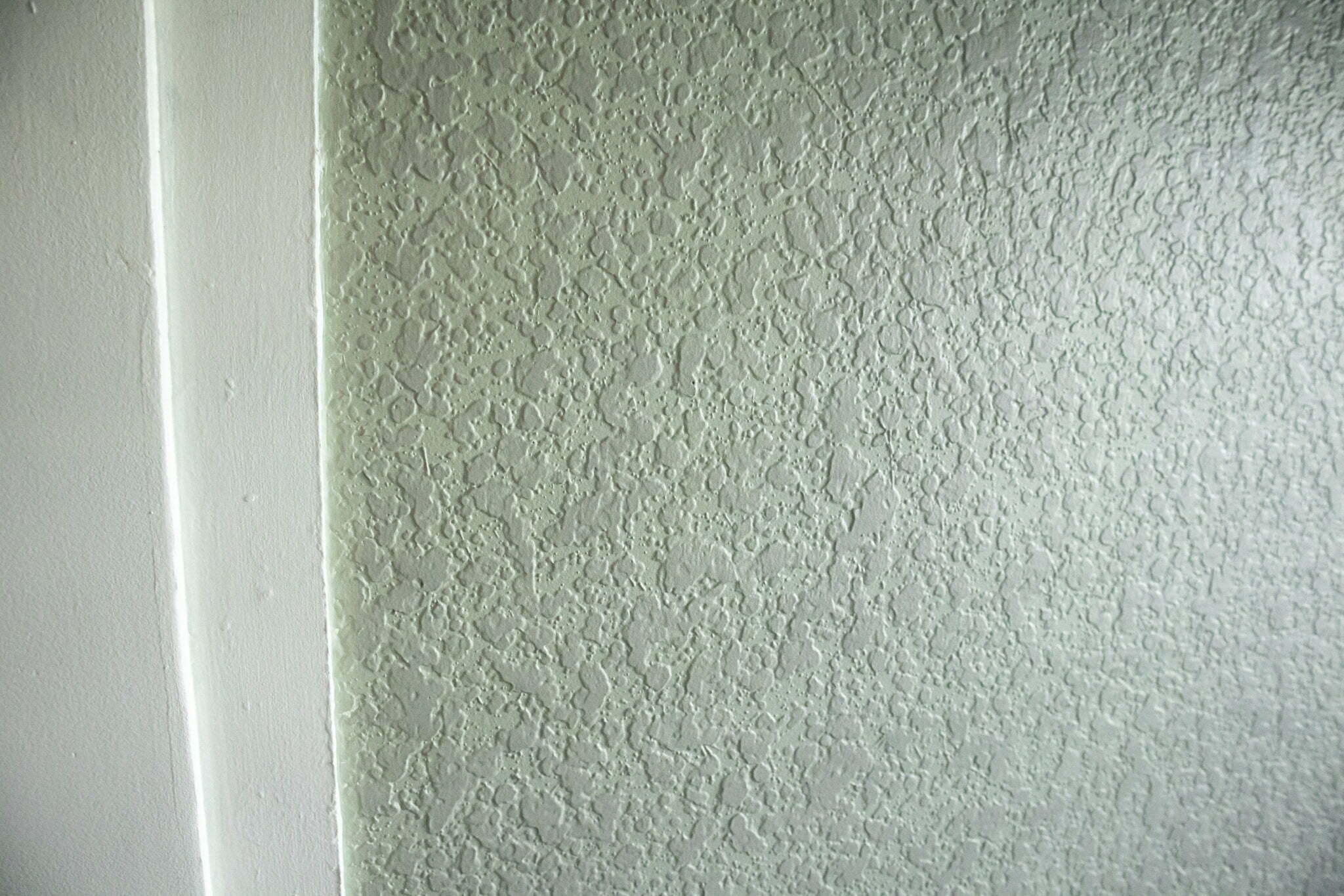
The original wall color was SW Agreeable Gray. I wanted another pastel like color to give a little bit of a contrast but as the room is not that big, I didn’t want it too dark. When I at first painted the entire wall in a pastel green color, it simply looked too dull. I was looking for a more interesting, textured type of look.
So I used a pastel type of green as the base coat to give the wall it’s predominant color. Then I mixed a slightly darker color with water to make it a very thin solution. This color will serve as a glaze providing contrast. I used a damp sponge dunked slightly into the glaze color and applied it with very light strokes to the wall. I did not apply any pressure, so that I gently only hit the high points of the drywall texture. This way I could achieve the nice textured color effect.

And here it is, the dining room accent wall with modern wainscoting. Now, check out my matching custom kitchen island transformation.


